Possible iGEM Logo
From 2006.igem.org
Jamesbrown (Talk | contribs) |
Jamesbrown (Talk | contribs) |
||
| Line 56: | Line 56: | ||
Hey! Where did the older logos go?! The new logos are growing on me. So many choices... :) --[[User:Ahessel|Ahessel]] 17:56, 11 April 2006 (EDT) | Hey! Where did the older logos go?! The new logos are growing on me. So many choices... :) --[[User:Ahessel|Ahessel]] 17:56, 11 April 2006 (EDT) | ||
| + | |||
| + | Okay, just had a meeting with Randy and CSBI (computational and systems biology) to lock down the logo for posters, etc. We have a winner! The logo below will be the 'official' 2006 logo, except with the gear over the 'i' being black. Thanks, James, and everyone for comments! --[[User:Ahessel|Ahessel]] 16:09, 12 April 2006 (EDT) | ||
| + | |||
| + | huzzah! looks great (IMHO) --[[User:Melissali|Melissa]] | ||
| + | |||
| + | I think it's good, though I still think that the gears should mesh (i hope that's the right english word), to symbolize a ''working'' system rather than just gears floating around. ----[[User:jonas|jonas]] | ||
| + | |||
| + | |||
| + | [[Image:logo2_jb.gif]] | ||
| + | |||
| + | ''Official iGEM 2006 logo (almost)'' | ||
Latest revision as of 14:29, 16 April 2006
Hey guys, I had a few spare hours free this evening and since I'm set to plunge into revision for the coming month I figured I'd have a shot at a potential logo for the competition before the work takes over; comments very welcome, see what you think of the first draft.
James, 01/04/06

| Comments:
hahahaha great stuff! It's got my vote....could you make the 'i' a little darker though?
--melissa |
My favorite part of the logo is the gear, the rest is very busy. I wanted to create something simpler that kept the gear motif, but make it from 'bacteria'. --Ahessel 19:53, 7 April 2006 (EDT)
I agree Andrew - the first draft is far too busy. I like the idea of simple design and minimal color scheme - if we intend to use this for stationary, promotion, T-shirts etc. simple and stylist is good. I know what you mean about the gear motif - it is striking and in a way kinda has a reference to a biobrick-containing plasmid.
I've spent far too much time on fieworks and come up with far too many alternatives/tweaks to mine and Andrew's attempts so far. May as well throw them up now to gather people's opinion. Some have promise, others are just darn right OTT. They do illustrate a few minor features that could be thrown together to get it just right thou.
James 10/04/06

Simple 3 | 
Olympic Gears |
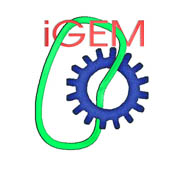
|
--Meaganl 13:41, 10 April 2006 (EDT) I did like that James's original idea had both the cell and the gear so I came up with this. It's in the "skeleton" stage as I think there could be a bit more going on with the cell. And now that I see the others I think I like the wider font for the text. |

|
--James I think you're right, gear & cell together - here's a step back towards the original - we're getting there... --Ahessel 16:13, 10 April 2006 (EDT) Hmmm. Is the bacteria too limiting? Already some groups are already moving on to both yeast and plant cells.
--Ahessel 15:16, 11 April 2006 (EDT) It's still too busy for my taste, but I'm a fan of more streamlined logos and wordmarks. They tend to be more enduring. iGEM last year hacked bacteria. This year, we may get plants and yeast. In five years, who knows? |

|
--Jamesbrown 17:11, 11 April 2006 (EDT) How about this folks? After a little deliberation - this is simple, works well in greyscale and b&w and has the whole essence of iGEM in a gear and plasmid/biobrick concept. |
all of these look great. my two favourites are the most recent one from James (most professional) and the first one (most creative). If on the first one you could turn down the contrast of the shading on the outside of the cell border while leaving the "i" of the DNA/nucleolus, i would believe it to be the uncontested champion :P --Melissa
Hey! Where did the older logos go?! The new logos are growing on me. So many choices... :) --Ahessel 17:56, 11 April 2006 (EDT)
Okay, just had a meeting with Randy and CSBI (computational and systems biology) to lock down the logo for posters, etc. We have a winner! The logo below will be the 'official' 2006 logo, except with the gear over the 'i' being black. Thanks, James, and everyone for comments! --Ahessel 16:09, 12 April 2006 (EDT)
huzzah! looks great (IMHO) --Melissa
I think it's good, though I still think that the gears should mesh (i hope that's the right english word), to symbolize a working system rather than just gears floating around. ----jonas
Official iGEM 2006 logo (almost)

